Design Techniques: Brainstorming, Sketching, UX Design, UI Design and User Testing.
WeTransfer’s current strengths are a given in everything they do and built: simplicity, trust, delivery, great sending and receiving.
Simplicity. That’s something that people love about WeTransfer and what they find hard about the new proposition. Instead of just sending files, they have to collect them and after that, they can share it. But what if we can make this simpler. Maybe we could make the way of collecting in the app easier? It could improve the user experience of the app. We brainstormed with the whole team to see how we could make collecting files easier.
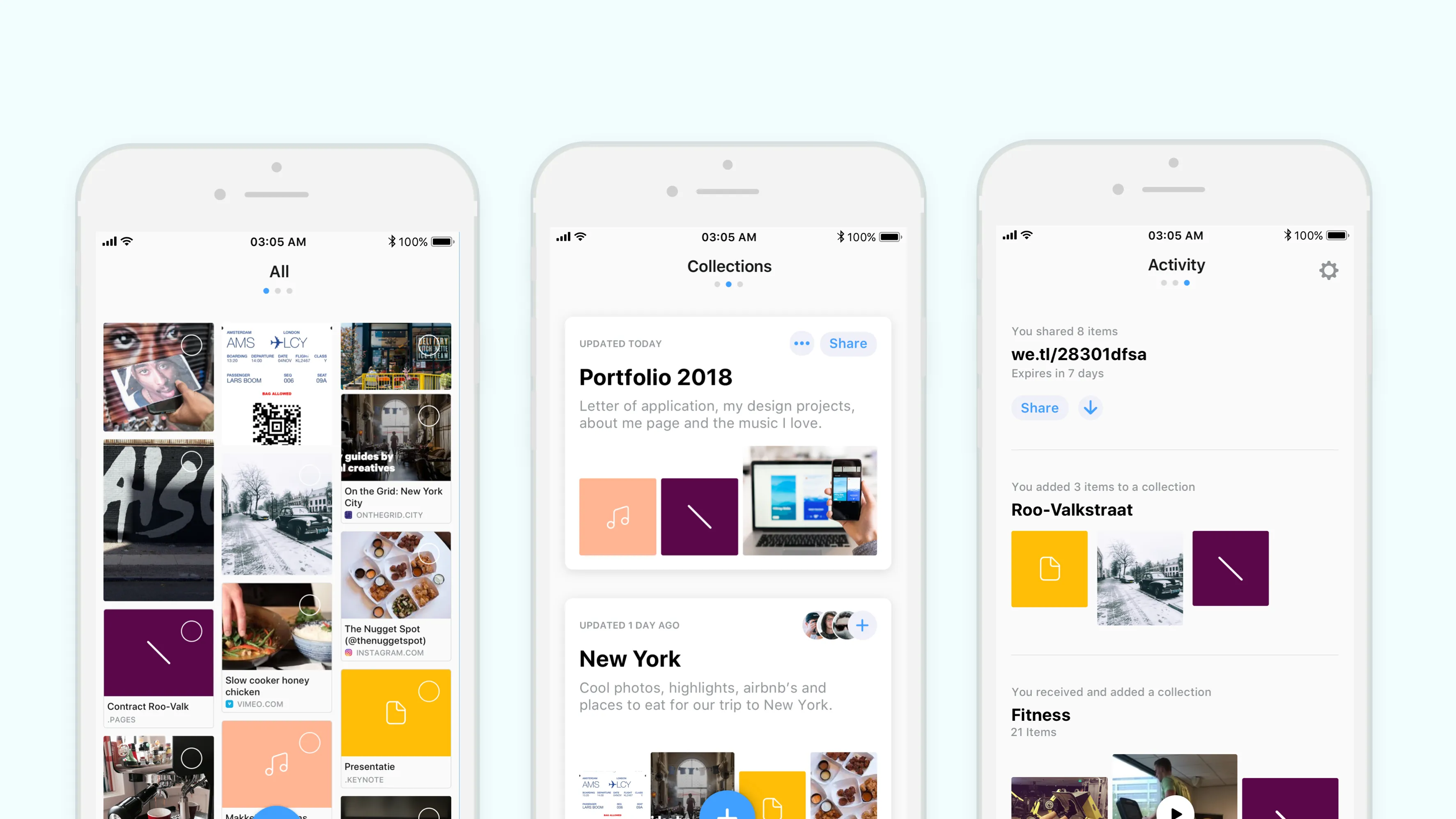
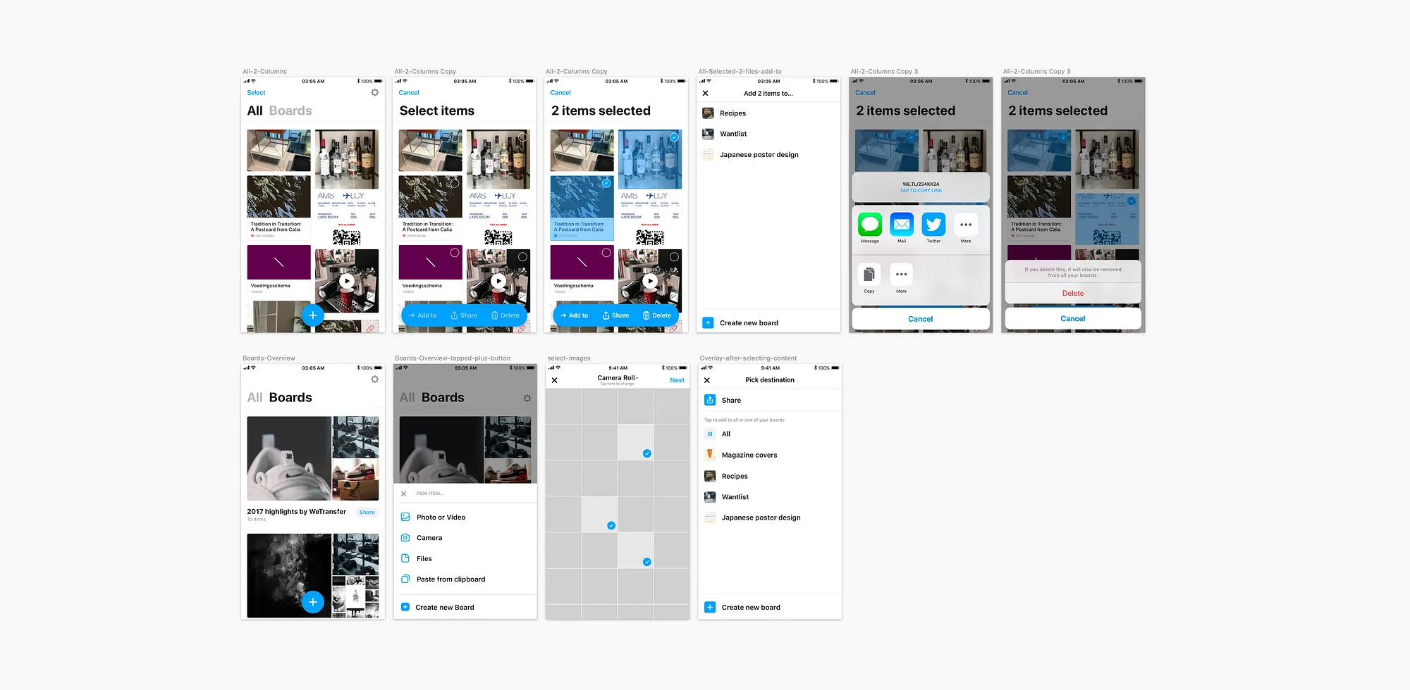
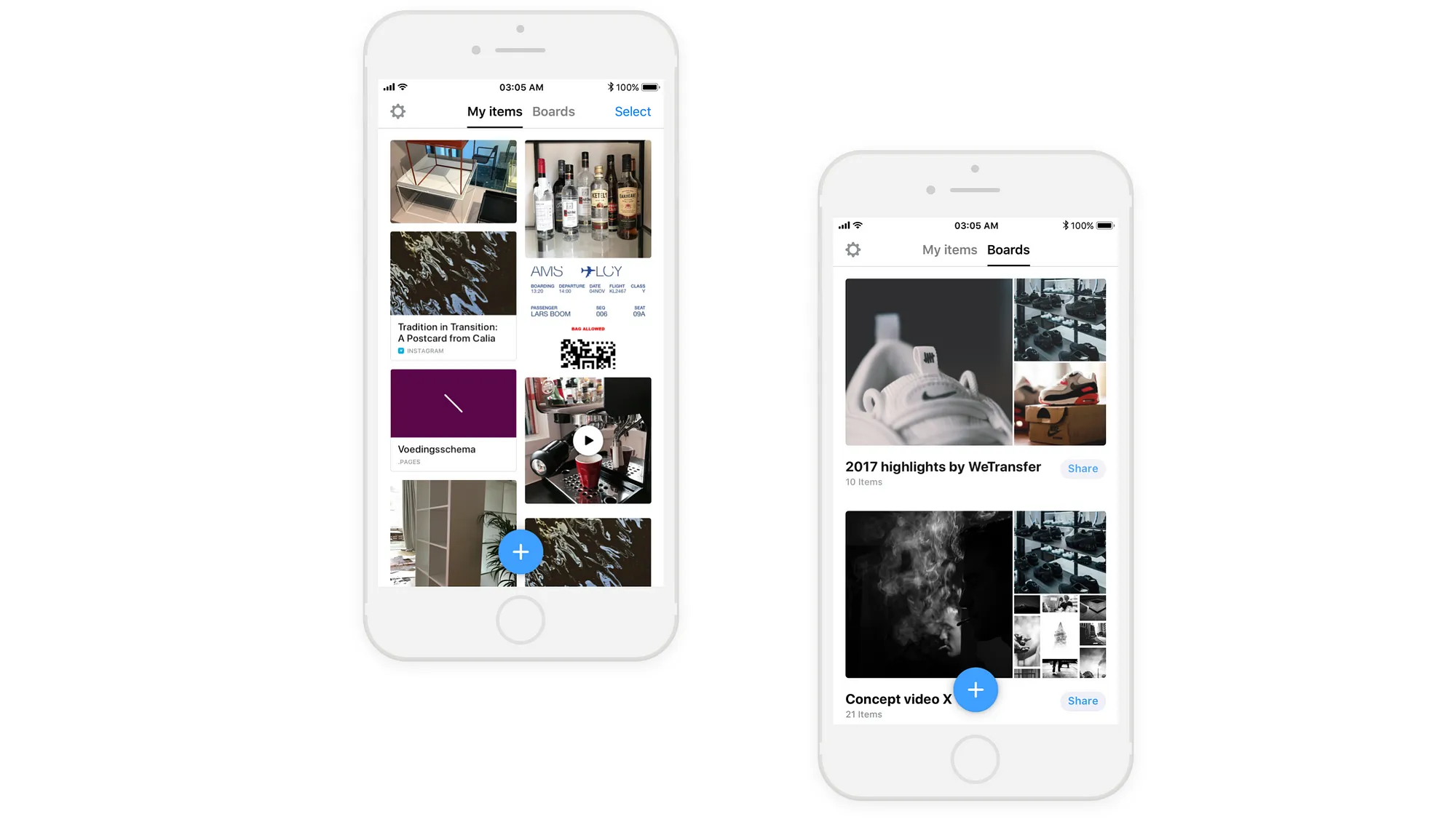
One of the ideas was to create a new section next to boards where we show all the content. Because sometimes you just want to add something to the app without putting it into a board. It could also be a trigger for people to see new connections and create new boards. That’s the beginning of All and Boards. All should be the place to add the random photos or files that you just want to share with someone and not create a board for.
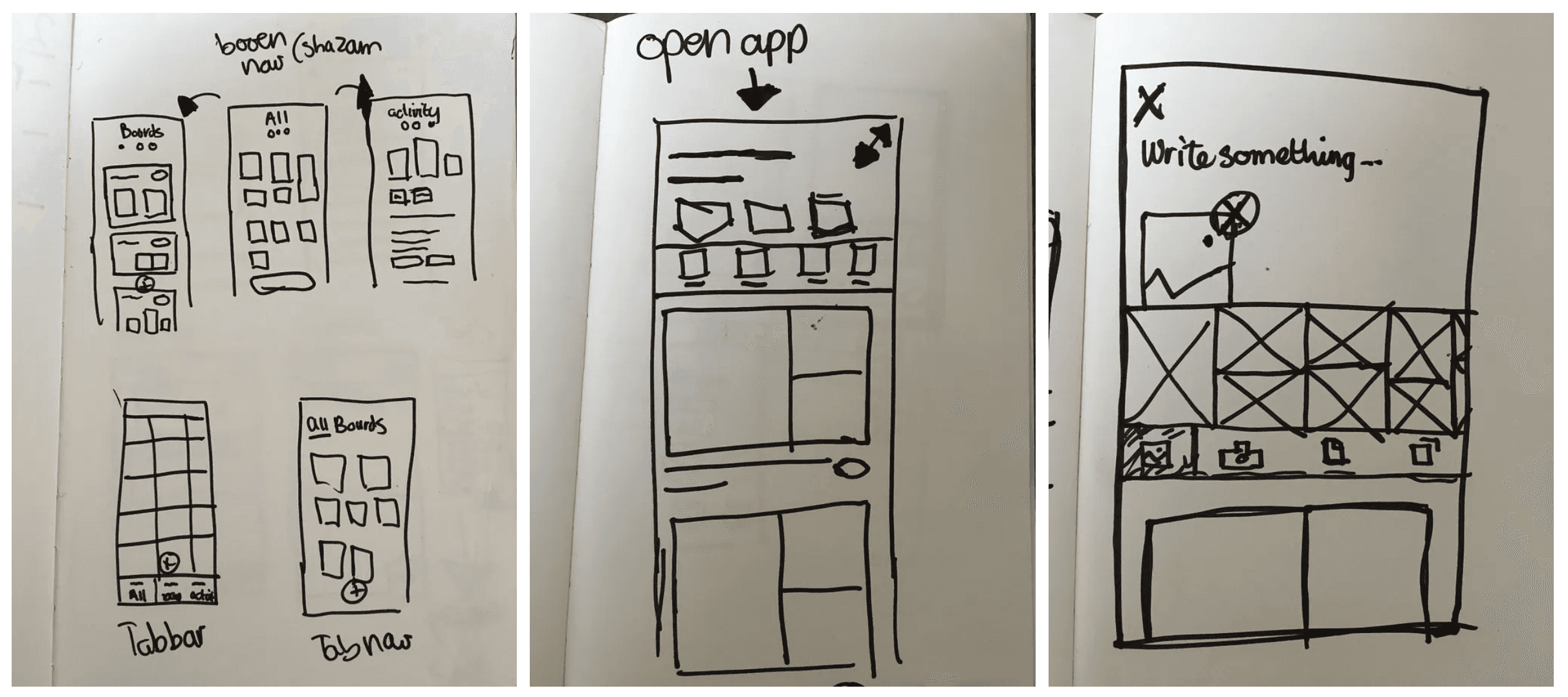
Sketching ideas
The most challenging was the navigation. We had now two important screens. All your content and content that you’ve selected on boards. Should we combine it? Or create a tab bar? How could we move items from the All view to a Board? That’s why I decided to do some quick and dirty sketching for all my ideas.
Design
All will be the place where you can collect your content and do what you want with it. From here you can create new boards, add to existing boards or just share a WeTransfer link with others.

While I was sketching, I decided to change the board’s overview. I changed the size of the images in the representation of a board, the place of the title and I have added a description. It had to look good and scannable even when your content was ‘ugly’.
We also had the idea of Sponsored Boards. These boards are curated by WeTransfer. WeTransfer is famous for giving talented artists a place to show their work. The sponsored board can also be a trigger for the user to create a beautiful board by themselves.

There is no trigger for the user to come back to the app at the moment. I believed that if we created an Activity view that we could trigger the user to come back to the app. We could show different triggers in the activity view. For example, that you’ve added new files to a board, the single files that you shared and the items that the user received from others.

Minimal Valuable Product
They loved the idea, but we needed to scale down our designs so we could ship a minimal valuable product. Together with the product owner, we decided that All and Boards were our MVP and from there we could iterate on this version.
User Testing
When users created boards in the mobile app, we saw that they were shared with others most of the time. On top of that, the ‘Quick Share’ feature was performing well and fewer boards were created as a consequence. Both findings indicated that the mobile app is still quite strongly associated with and used for sharing/transferring. We wanted to know if the ‘All’ feature makes it easer to collect items in the app. That’s why decided to do 6 one-on-one sessions of 60 minutes. All participants were not familiar with the WeTransfer app yet. We had a mix of people with professions/hobbies in the so-called creative industry (photographer, dramaturg) and people with professions/hobbies outside that branch (project manager, yoga teacher).
While we were designing we were working on these two job stories:
Save for later (reactive)
When I find something of value, I want to hold onto it, So I always know where it is stored and (feel sure) I can always access it later.Focussed collection (active)
When I’m gathering stuff around a certain subject, I want to store it all together, so I always know where it is stored and (feel sure) I can always access it later.
We translated these job stories into fundamental research questions:
Is the ‘all’ feature the right way to answer the job story above? Does it help people to do so?
Does the ‘all’ feature makes job story A easier than the current way of collecting this content (f.e. in camera roll, or several apps)?
Is the difference between All and Boards clear on a concept and interface level? Do people understand what the difference is and is the difference perceived as useful?
To what extent is the concept of WeTransfer as a transfer service influencing the perception of users regarding collection and the app in general?
Results
The visual representation of the labels does not seem to be optimal yet. One participant read it as one thing, ‘All boards’, another tried tapping on the active states multiple times.
All’ implies that everything will be on there. So if we call it all, participants expect to be able to add content from ‘All’ to boards without the content being removed from ‘All’. And if one deletes from a board, it should still be in ‘All’ since “that’s where everything is”. Reasoning from that perspective, ‘All’ should actually be the basis of the app. Words people use to describe what it does: repository, dump, everything, pile.
We did see that a feature such as ‘all’ (or in other words a feature that focuses purely on collection) makes it easier to collect, it does not necessarily mean that the separate view of ‘all’ is the only way to solve this problem
Final version
In the end, we changed the All version to ‘My items’ to make it more clear for the user and that’s why we needed to change the bold ‘All’ and ‘Boards’ and the icon to make it clear that you could select items to do something with it.
Shipping and focus on data
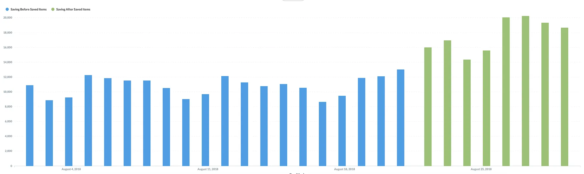
The release of the “my items” feature on Android and iOS has had a great impact. People are collecting more items into the app. That’s something that we saw in the data. We decided to keep working on it and improve the ‘my items’ view over time.
The green graph is saving items after we’ve added saved items

© Portfolio by Bart